Be Ready to Face Google Penalty for Non-Mobile-Friendly Websites!
Are you too running a blog or website which is not having a mobile-friendly version? If so, be ready to face Google penalty for non-mobile-friendly websites. Read on this blog post to know more about it.
It is indeed true that the importance of mobile friendly websites is increasing badly. As I have already mentioned this so many times that Google is giving preferences to the mobile friendly websites over those which don’t have any mobile friendly versions.
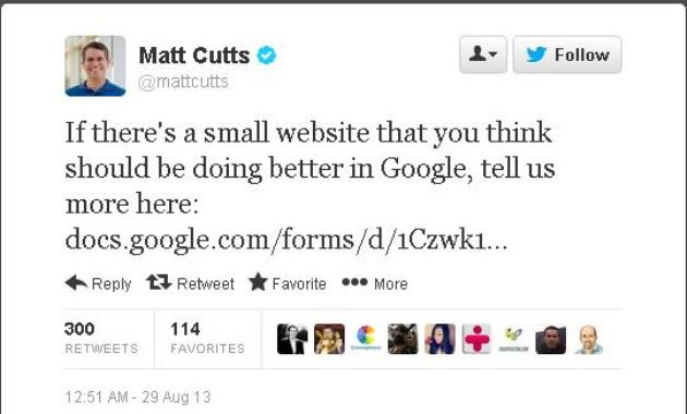
This news illustrates the same.
If you have searched something on mobile phones recently then you must have noticed a green smartphone icon along with some results. Did not you notice the same?
These green icons are a way to tell you that these results pages are mobile friendly websites and you can clearly visit the pages on your smartphone. Google is becoming advanced day by day.
It is clearly in discussion among the SEO world that Google is actually going to penalize the sites which are non-mobile friendly in nature. Thus the non-mobile-friendly results are sure to get a demotion in the search rankings soon.
Ideally you can have two options, one either choose a responsive design for your website or develop a light version of your website for mobile and tablets.
If you ask me I would always suggest you to have a responsive design for your site. If you are running a blog then always choose the responsive design or template for it. On the other hand if you are having a website, I mean a static website as well then too you should try for a responsive design. If you don’t know the other SEO benefits associated with it you might also check this blog post of mine: SEO Benefits of Responsive Web Design!
Managing a new version of your existing site for mobile devices is not a good idea. Though I won’t say that these are obsolete, many bloggers and website owners are still preferring it, but in fact it becomes too hard to manage two websites, one for desktop, pc or laptop and other one for mobile phones and tablets.
Very soon I will write another blog on how to optimize your website for mobile searches. Stays tuned here or follow me on my twitter handle to know more about it. I hope I will soon come up with the same.


Great post. Very informative.
Thank you so much Ramya 🙂
Yay…i have a responsive design for my site 🙂 Thanks to a smart someone!
Oho, 🙂 Nice 🙂 Lucky you…
Ohh! this is a news for me.. have to work on this I think… thanks for the update Alok…
Thank you so much Maniparna…
Really ? Thanks for sharing these valuable words
Yes Yogi jee 🙂 Thank you so much for appreciating.
Now I think, instead of the green smartphone icon, Google clearly states “Mobile Friendly” just below the result.
As you mentioned, there are two ways to make a site mobile friendly, one is responsive web design and the other is having a separate m. version of the website. And everyone (even Google) always recommends responsive design. But then why isn’t Google itself adopting a responsive design? Google has a separate m. version. Same is true for many other famous sites. Take timesofindia.com for example. Its not responsive, but has a separate m.timesofindia.com for mobile phones.
Buddy, one thing which none of us likes is person not using his/her real name for comments 🙂 You are actually doing a type of comment spamming.
Anyways, thanks for sharing your opinion with us. It is true that some major websites, and even Google too uses mobile friendly version of their websites for visitors from mobile. No matter which ways you opt, but your site should be easily accessible to the visitors coming from Mobile Phone…